Rebranding in the open
Creating a digital-first, accessible rebrand to shake off Wellcome’s corporate baggage and big pharma associations
Bringing the Wellcome re-brand in house gave us the opportunity to design in the open, shining a light on problems we might have otherwise missed.
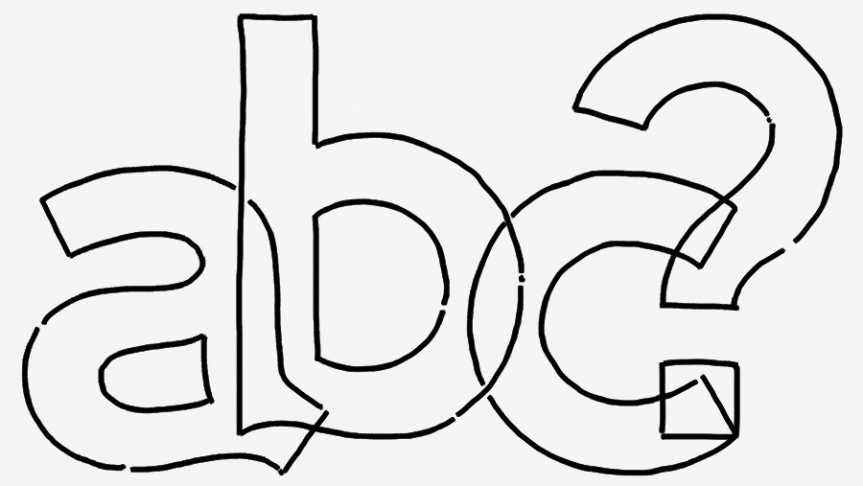
Rebranding accessibly
While engaging staff in the re-branding process it became clear that the new font scored high for personality but low on legibility – some colleagues pointed out it wasn’t dyslexic friendly.
Collaborating with the brand team we explored if we could keep the bold attitude and be more accessible and readable? Working with the font foundry to create a custom font with the personality of the original but the characteristics of a dyslexia-friendly font, we then tested the adjusted font with neurodiverse participants including dyslexia, autism and ADHD where it performed better than the original and Helvetica. I wrote about the process of creating more accessible typography on A List Apart and reprinted here.
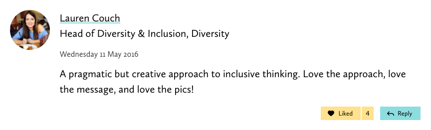
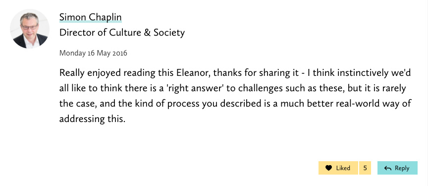
Staff and leadership show a lot of love trustnet and the transparency it’s brought to our ways of working.
Pragmatic impact
We wanted to create a brand where we could create impact without bloating all our digital output with heavy-weight images so that our brand could be more performant and easy to use.
Everyone wanted more colour and customisation to bring personality to the brand, and everyone loves big colourful pictures but…
- It can be hard and expensive to source good high quality, high resolution photos
- It costs users of our site money to download large images
- It takes time to load large images on poor connections delaying access to our content
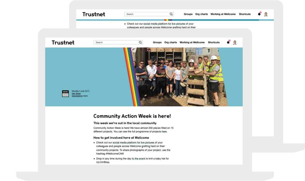
The new brand ‘W’ window gave us an opportunity to play with dynamic framing.

Year round Pride
We were asked to add a rainbow logo for pride month. But rather than flying a temporary flag, I worked with the developers and members of the LGBTQ+ staff group to create a rainbow ribbon that could be added to any page, paired with any colour and as well as being globally applied for pride month and also individually added to any page at any time of year.
- CSS, light and fully responsive
- Works without a picture